Tuesday, 20 December 2011

Project four brief - photography


Preamble
In this project you are to consider editorial design, looking especially at the combinations of image and typography. You are to spend time looking at grids and how they are used to underpin the layout of pages for magazines and books.
You are to take a series of your photographs that fit the topic Environment
How you choose to interpret this word is up to you. It may be that you make a series of images specifically about a particular environment or space, such as a room or home; or it may be about The Environment, including weather or issues of ecology. 
You should present in your sketch book at least 20 photographs.

The Brief
1) You are to design layouts for two double page spreads for a fictional magazine called, Photography Now. The layouts should showcase your own photography on the Environment topic. How many images you use in your spreads is up to you. The format of these pages is  200mm x 200mm per single page. You may design in any creative style that you wish, based on your research findings (which you must evidence). You must use only Quark or InDesign only for layout.

2) You will need to have created a body of research and planning for your photos. You must show links between this and your editorial layout. You will need to have a body of photography work completed fairly quickly. You may use stock photos while planning your dummy layouts; but your final must contain your own imagery.

3) You will need to have created a body of research in which you explore exemplars of editorial design. You should try to make analysis, using overlays, of the underlying grid structure of some of these. You should also comment on styles used. You must evidence links between this and your layout.

4) You must also write and layout within your spreads, a piece of text of between 200 and 400 words. This will be a personal justification of how you approached your photography. You should consider and use appropriate application of typography to set this text.

Research
Research is a key component of this module. The research you should present must include preparatory studies for your photographs; research on layout styles and techniques, including grids; specific research into the magazine you are designing for.

Wednesday, 7 December 2011

Evaluation

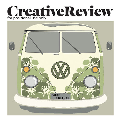
The way in which my cover and double page spread meets the needs of the brief is that for the cover I have used my own image that I have created. I made this by drawing it by hand and then I scanned it in to be able to edit on Photoshop. For the double page spread I used a found image from a photographers website, referencing this image on my blog. Also referencing the article on the blog in full. The only way I think that it fails to meet the brief is that when printing it off, I realized that there are a few mistakes that I haven't noticed before when I did practice prints. I will reprint these for portfolio though. The strengths of the visual communication on my front cover is that I think it portrays the theme really well, illustrations that I have done show what I am basing my subculture on and also the shape I have done these illustrations in, both these components link together to make the visual communication work. The weakness of the visual communication I feel is on the double page spread. I think that by only having that one image - it works but I don't think it fully puts across the subculture with just the single photograph. The way in which the pieces could be mis-read by the audience, the audience being, the usual customers of Creative Review and people interested in the surfing culture, I also don't think there is a limit on the age group although I think that it would be from the age of 18 youngest. But the only way I think that this could be mis-read that it could look as though from the cover it is a issue on illustration. Although if you look under the title it does say it is 'The Surf Issue' but this isn't automatically visible. A way in which the front cover could be developed or improved is that maybe to put something else on there. I think that if I had more time with this cover to develop it further I would want to do some more illustrations to put along side the ones I have on there. With the double page spread I think that I would put a little more detail in around the text. I am happy with this layout though as I think that sometimes the less on a page, can look better and less daunting.


My time keeping throughout this project I think I kept quite well. I did all my research at the start and gave my self enough time to do designs and enough to be able to change these designs if I needed to. I think that I did enough research to be able to get my ideas and final designs and get a  good understanding of the subculture and its history, style and graphics.I used my research to generate ideas by looking at David Carson and other poster designs. I liked David Carson's illustration designs and so I came to my final from going online and searching through a lot of his art work. Also when I made the VW Camper van on illustrator it came from the culture that is well known. It was quite an obvious thing to look at for the surfing culture and I thought it would be a good idea to make it so that any audience would instantly recognize this cover as a surfing cover. I experimented during the project using InDesign, Illustrator and Photoshop to create different ideas and change colours. As a personal target I wanted to use colour in this project and so I played around with this a lot in this project. The parts of the project that I enjoyed and feel that i worked my best at was the designing process, experimenting with ideas and colour because I wanted to try new things out and this was exciting but on the other-hand the part that I didn't really enjoy was trying to get InDesign to work properly for me. I have never used this program before this project and so I found it quite difficult to try and learn parts of it in such a short amount of time. The printing process was also quite difficult, having problems with the sizing when trying to get both the pieces to print from InDesign and Illustrator. To make future projects easier I want to develop my skills with using InDesign, I think that I could really benefit from this.

Finals

Front cover


Double page spread


The article that I have used in the double page spread was from:

I have used only small sections of the article rather than the whole thing.

Tuesday, 6 December 2011

Double page spread final ideas


This is my first design of my double page spread. I just wanted to have a quick recap on how to do a few things on InDesign so I did this idea. I do think that it is a little bit too plain and boring. I think I might try and find a smaller article to use as I think there is too much text and I would like to make the image the feature that stands out the most. I have decided that I want to use the VW camper as an image that I am going to use as I think that I will use my surf board design as my front cover as I think I am more comfortable with that design and am slightly more passionate about the simplisticness of it and I think I want that theme to carry on through to my DPS.


This screenshot is a development from the first design that I did. I changed it so that the text when around the image of the VW Camper. I still think that there is too much text on the pages as I wanted it a little more minimal. 

IDEA THREE.


This is my favourite idea that I have made from the three. I think that I have finally come to the right amount of text on the pages. I cut down the article by about half and put it into sections which I think looks a lot better than in about 4 columns. 
I think that I will go for this idea because I think it relates best to the front cover and also the theme. The image that I have used I think links better than the VW Camper. Even though I spent a long time on the Camper van, I think that overall this image looks a lot better to go with the subculture. 


Friday, 2 December 2011

Front cover ideas

IDEA ONE.


This here is a version of a final idea I have made. I am going to develop this more with the VW Camper. I have already done the development that I think will look good and for my next step with this design I am going to put that image of the Camper into this idea.


This design is a different variant of the idea that I have already done. I have decided to stick to this sort of theme as I think that it links really well to the subculture. I have added the number plate with the letters 'SURF CULTURE' as then I think that it shows what the article in the magazine will be about. 
To make this idea a bit better I think I am going to make the VW thinner like the original drawing that I did on Illustrator. I think this one looks slightly odd now from looking at it at a different time of looking at it. It looks too bit compared to the other ones I have done. 
I used the basic outline in this idea, I thought that I would try it out to see what it would look like and I found that I quite liked it. I probably won't use this as my final because I have decided that for this project I would like to use more colour than I have in previous projects. But I do like the simplicity of this one. 

I really like this one also. I think that the way that the image is still recognizable as the VW but the background is obviously parts of the image in the middle it all seems quite strange to look at but I think that it works really well. Again with this idea though I think I need to thin the whole piece out. It all looks a bit too stretched out and I don't think that part of it looks good. 


-----------------------------------------

IDEA TWO.


Surf board shape made from waves with surfers.

This is a drawing that I have done that goes back to my original thumbnail ideas. Doing an illustration by hand and then putting this into photoshop and editing it. I am really pleased with how this has turned out and I am going to experiment on Photoshop and Illustrator with colour, positioning and size.


This experiment was my first one with this new illustration. Personally I really like it, as I am fond of the saying 'less is more'. I think that this definitely applies to this cover. The detail is what grabs you. But the only thing I would say that I want to improve on is the colour. As a target to myself I really feel as though I want to start including colour in my ideas. So to further this design I am going to do more experimentation to create an image that is more visually exciting for other viewers.


These three surf boards are the same as the first initial black illustration. I have edited the black one in Photoshop three times to create these ones in colour. I do think that I have succeeded in making them more visually exciting like I had said in the previous design analysis. I am going to try out cover designs with these. 


This is the design that I think I am going to go ahead with. I have chosen to use these colours because they are quite natural and calming colour to see. They represent the feel to the surfing culture well.  There are a few things that I need to change to make it right. I need to slightly move the blue surf board nearer to the green one, measuring the gap between green and yellow. I am going to also just experiment with putting a border around the edge to see what looks better.