IDEA ONE.
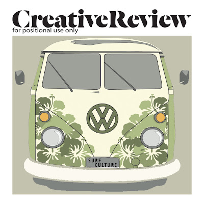
This here is a version of a final idea I have made. I am going to develop this more with the VW Camper. I have already done the development that I think will look good and for my next step with this design I am going to put that image of the Camper into this idea.
This design is a different variant of the idea that I have already done. I have decided to stick to this sort of theme as I think that it links really well to the subculture. I have added the number plate with the letters 'SURF CULTURE' as then I think that it shows what the article in the magazine will be about.
To make this idea a bit better I think I am going to make the VW thinner like the original drawing that I did on Illustrator. I think this one looks slightly odd now from looking at it at a different time of looking at it. It looks too bit compared to the other ones I have done.
I used the basic outline in this idea, I thought that I would try it out to see what it would look like and I found that I quite liked it. I probably won't use this as my final because I have decided that for this project I would like to use more colour than I have in previous projects. But I do like the simplicity of this one.
I really like this one also. I think that the way that the image is still recognizable as the VW but the background is obviously parts of the image in the middle it all seems quite strange to look at but I think that it works really well. Again with this idea though I think I need to thin the whole piece out. It all looks a bit too stretched out and I don't think that part of it looks good.
-----------------------------------------
IDEA TWO.
 |
| Surf board shape made from waves with surfers. |
This is a drawing that I have done that goes back to my original thumbnail ideas. Doing an illustration by hand and then putting this into photoshop and editing it. I am really pleased with how this has turned out and I am going to experiment on Photoshop and Illustrator with colour, positioning and size.
This experiment was my first one with this new illustration. Personally I really like it, as I am fond of the saying 'less is more'. I think that this definitely applies to this cover. The detail is what grabs you. But the only thing I would say that I want to improve on is the colour. As a target to myself I really feel as though I want to start including colour in my ideas. So to further this design I am going to do more experimentation to create an image that is more visually exciting for other viewers.
These three surf boards are the same as the first initial black illustration. I have edited the black one in Photoshop three times to create these ones in colour. I do think that I have succeeded in making them more visually exciting like I had said in the previous design analysis. I am going to try out cover designs with these.
This is the design that I think I am going to go ahead with. I have chosen to use these colours because they are quite natural and calming colour to see. They represent the feel to the surfing culture well. There are a few things that I need to change to make it right. I need to slightly move the blue surf board nearer to the green one, measuring the gap between green and yellow. I am going to also just experiment with putting a border around the edge to see what looks better.


No comments:
Post a Comment