Monday, 30 April 2012

Designing a logo

To make my page a little more exciting I thought of designing a simple logo to put onto my page, which would the represent me and my site. I am going to show my ideas here, I may not go ahead with it, but I thought that it would look a little more professional on my site to have something like this.

Shapes that I could base the logo on.


Thursday, 26 April 2012

Ideas for my Welcome Page - making on Photoshop

Here I am going to document some ideas that I have for my site using Photoshop for designing. Using the same process as what I previously showed as experimentation. I am going to show my progress with screenshots. 


This is the size of web page that I have been advised to set my site at. 


This is a first idea that I've had. I have decided to use my surf board project as part of my homepage here as this was the project that I found most enjoyable and loved the outcome of and I think they go well with the simple theme that I wanted to go with. I will be experimenting more, but I quite like this first outcome that I have done for my home page.

Second idea with the surfboard project as the image on home screen.
Here I have just played around a bit with the navigation idea. I have again used the surf board project as a basis. I really like the way that I have experimented, moving my name and navigation links around the line of the board. The only problem that I think that this could have is that if this stayed like this through out the whole of the site, there could be the impression that all my work is based on surf culture.

On the other hand, I could use this as my whole home page and then when the links are clicked on, change the navigation to something more simpler.


Here I have made the previous image bigger so that it will be the whole of the welcome page. With this, I thought that by clicking home it would then take you to the next page. This would involve an extra page that usually you wouldn't need, but I think that it could be a nice extra touch to the site.


I did this experiment from the first proper idea that I had. I decided to only use three for this idea to see what it was like to simplify it slightly more.


This is another drawing that I did for a previous project, but I didn't end up using it. But I still quite like the drawing. I tried to position the text where the face would be.


Another idea I've done I have used a photograph that I took and edited for the environment project. I quite like this as my welcome page because its a lovely picture and it shows my location well. The only thing that I think that I would have to change is that make it clear on the home page that it is a graphics site instead of a photography website.

Ideas for my Contact page - Made in Photoshop


Just setting up the sizing of the webpage - the same size as my other pages (1024 x 768)

------------

Before I started designing my contact page, I wanted to do some research and find something to inspire me with making something new and exciting in a way to encourage people to be able to contact me. So I went to other designers and companies that do this. I found this really good one on http://www.attitudedesign.co.uk/contact/


Here they have made their own designs for the icons. I thought this was a good idea, I don't know if I could do this type of this, but editing the already existing icons I could do, so that it fits in well with my site. 

http://www.attitudedesign.co.uk/contact/
 

Monday, 23 April 2012

Making a website (Photoshop to Dreamweaver)


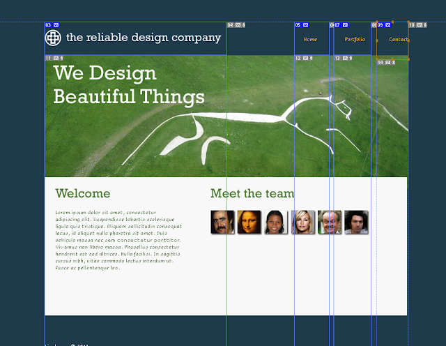
To make a webpage in Photoshop, we were advised to use the preset size of 1024x768. This is a general size and works for most screens well.


For experimentation, Tim put a Photoshop file up on Moodle for us to use, which we could then slice. Here I have started to do the slicing, by clicking on this tool:
 then dragging around the separate sections.


 Here is the final of the slicing that I did for the experimenting. By just going around each department. Then saving it as a Photoshop file.


I then saved it again, but by going File > Save for Web & Devices


Clicking on '4-up' along the tab bar, brings up these 4 views, giving an option of the quality of  the page. It will automatically choose the best one for you so I carried on with that, then saved it. 


After doing all that, I then opened the page from my files and it opens into the browser, showing how my page would look. 

(in Dreamweaver)

Opening it in Dreamweaver will allow me to make another page. So what I did before was make a duplicate of my saved 1st page, calling it 'portfolio' and this then allows me to change aspects of the second page. 

in the browser - links working to home and portfolio page.


Monday, 16 April 2012

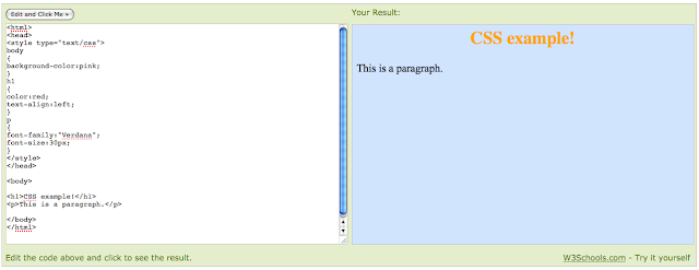
First coding research

http://www.w3schools.com/css/tryit.asp?filename=trycss_default
SimpleViewer:


Experimenting with SimpleViewer - making things into different colours and then the view is to the side, making it helpful to see what is actually changing.
Next step of some experimentation I added my own work to the list of images - just an images that I used for my research in the last project, this was just to see if this would work properly.


Dreamweaver:

 Changing the images to Cloud images I was given for coding practice - Coding changes:


This is the change that it made to the previous site after clicking on Index.


Sunday, 15 April 2012

Task 4

Now select ONE designer or company that you find particularly inspiring. Choose THREE pieces of design (these might be separate items or three campaigns of linked items) and make analysis of each.

The first company that I have chosen to look at some of the designs for is NB Studio http://www.nbstudio.co.uk/ 
I have chosen 3 pieces of work by them that I really like. These pieces are:
The pieces that I have chosen are in a series, they are all part of the same project, but I really like the typeface and the simple layout.


 The thing I like about this piece is the typeface and simplicity of it. I feel that I can relate well to it as although it isn't a simple serif typeface, and that is what I would usually use for work I think that this is really effective and looks really elegant.


This is part of the same project, linking together and making a stationary set, I think these look really professional and high profile for the client that got this design. 

 This is the site that ties up the whole set of this project. I think that they way that they have kept that typeface the whole way through, even including the website page, is a good touch that if people were to see any of it, they would realize what it was from. 

----------------

The next company that I am going to look into at their work is Studio Cuculic http://www.studio-cuculic.hr/?ln=en 
I didn't look properly into this website for my analysis before where I was looking specifically at the site, but looking at their work is a completely different story. I think the work on this page is really goo, I love the style that they have and the illustration is a lot like what I try to use in some of my projects, I think that this can really show someones personal touch.

This is the first piece of work from them that I am looking at:

http://www.studio-cuculic.hr/radovi.php?ln=en&c=2&ID=112
I really liked this piece of work for the clever way in which the design has been done at the bottom of the persons shoulders, the head is what really caught my eye, the bright colours is so eye catching and that then leads you to look on further to more of the image. 
The pearls that are around the persons neck makes it all the more human, just dressing her up, even though there is nothing that looks less like a normal female drawing, that is what I also liked about this piece. I just am drawn to illustration as I find it really interesting.


 I liked this piece because its quite sinister and strange. I think because there are rats on the page, it would make people look because they are quite bright compared to the darkness of the rest of the piece. I find this quite inspiring because of where the type has been set, I like the way that it all links in a way, but it is also so separate.