Wednesday, 9 November 2011

Second postcard - Letterpress

So, the second postcard that I have been asked to design has to be based on a particular time or piece of history to do with type. For my postcard of type in history I have chosen to base this on Letter press. I have previously experimented with this process with real letter blocks and really enjoyed making the typography with them. Here is an experiment that I created for a previous type project: 


I really like this photograph of the letter blocks. I think that the colour of the letters in the middle really make it stand out. Unfortunately I cannot recreate an image in the style of this as I don't have the equipment. Although I am trying to think of alternatives that I could do to make my own touch on a piece.


I think that a more simple piece like this for my postcard design could also work, the one line of figures I think would make it allot easier to read, and still see and understand what it is about. I want the piece of text on the front to say 'The History of Type Conference at St Bride Library' or maybe just something shorter like 'The History of Type'. This way I think it shows exactly what it is and the rest of the information will be on the back of the postcard.

-----------------------

From looking at my work from a previous typography project and images online that include the actual blocks and also the print from these blocks, I have decided that a cheaper way of doing this is to cut up potatoes and make letter blocks from these and print. I am going to try this and hope that this could work just as well. I will photograph and document the progress of this experiment on here.  

---------

Progress of potato letterpress.
I have completed a few initial experiments with the potato cutting idea. I think that this is a good way of trying out new processes in a cost effect way. Here are some photographs of some steps of my experiment.


The potato printing experiment didn't work out as well as I'd hoped. this is because when printing the potato cut wasn't as straight as it needed to be. I don't think this could be helped though as it was quite difficult to cut just with a knife, it was never going to be perfect. It was also quite a messy process. I'm glad that I tried this as I think it has given me more of an understanding about the time and effort that was needed to create this type of printing technique. 

-------------

Another idea that I have had to create a letter press look to a piece, is to do it all digitally, using illustrator to draw the blocks. This way I could make the piece look like the actual blocks, like the image above from 'shutterstock.com'

Postcard One Final


This is my final design for the Garamond postcard. I think from the 3 ideas I had this struck more of a graphics feel to it. I think it showed exactly what the type is, in it's simplest form, but letting you know what is needed to know. The text on the back I think does the same thing, telling you basic information about the typeface, then at the bottom 'The history of type conference at St. Brides' leads straight from the information you have just read, giving you the information without you quite realizing, purposefully reading it. 

Monday, 7 November 2011

Development of ideas

I have started to make a few designs on the postcards, I have used Illustrator to make a few first initial ideas. One of them was this:


Garamond idea one.


I have used grids to get everything in line, as I have learnt from the previous project, where I didn't use the grid, not everything was in line as much as I would of liked. This was a quick first idea, mainly to get used to using the grids and lining up all the type. To make this idea better I would make the 'aramond' part the same width as the G, possibly making the G slightly bigger, instead of shrinking the other text. 


-----------------------------------------


Idea Two


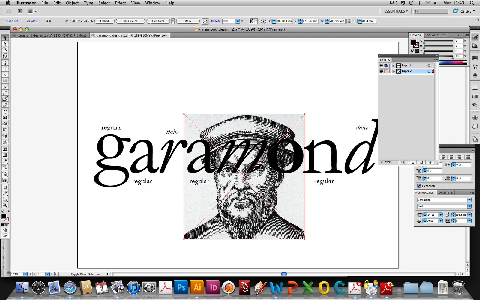
(1) First of all I did all the letters in this idea separately, in order to be able to place and edit each of them individually. I wanted to use all of the typeface family, because I think that after editing and placing each letter it looks allot more interesting with a variety of things to look at. 


(2) I added an image of the creator of Garamond (Claude Garamond) that I found on the Internet, to give it a bit more interest.
 I think that the image fits well because the effect of the way it has been make then tells us that the typeface is old and has that old style.


(3) I have placed the face of Claude Garamond here because I think it sits well inside the O, it is as thought he has been framed. The importance of him being on the front of this postcard is high because being the designer, it is appropriate and if being interested in type, recognizable.


(4) This part here is just showing that I have cropped the edges around the image of Claude Garamond. Making the edges round to be able to fit inside the O. I did this using Photoshop, making an oval the right shape and then erasing around the edge. 


(5) This is my final for this design idea. I am pleased with the outcome of this idea because I it is simple and effective. The plain black and white theme running throughout I think emphasises the impact on the image and how it all links together with the description of the text. 
-----------------------------------------


Idea Three:


This idea I think was quite strong with the colour. I wanted to experiment with small bits of colour within an idea and I think it has worked quite well. Although the green has no reason to be there, that is the only reason I don't think that it would be suitable for a final. I think it looks quite strong as a design but not quite right for what I need. In the image just above I have made the O in black and I don't think it looks quite as interesting. I was inspired to do this idea from poster research that I did from the typeface. 


Poster/Postcard Research

I began looking at other posters that include Garamond in their pieces. I found some online that I thought were really effective.


This poster was designed by a graphic designer called Sherry Saunders. She has created a poster with the simplicity that Garamond is the typeface that could look good with anything, just like the little black dress. I think that this poster has a great appeal, especially to those who have an interest in fashion also, it connects the two and has a double meaning. It is effective in the fact that the dress is also made of the typeface, wanting you to look at the poster further. I like the simpleness of the poster, the way that there is no colour I think fits the theme and look well. Although in my designs I would like to include some colour, I will also try this approach as I think this poster is really effective. 


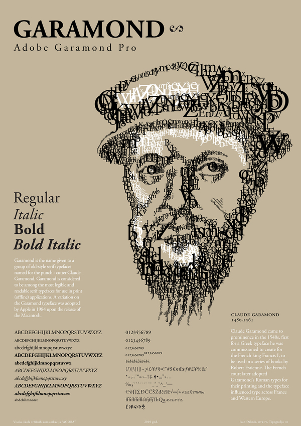
This is quite different to the previous poster that I have looked at. This seems to be more of an information poster, that you physically would have to stop for a while to read. Although if I was to see this in the street, the visual the designer has created with type would definitely catch my eye, as it would to people who are interested in the creative world. The colour ways of this poster I think work really well, there are only 3 colours involved which I think will not take your attention from the parts the designer wants you to see first.  All in all, I think this is a successful poster.


This, like the poster above I think portrays the Garamond text well. It includes all 3 different Garamond family type ways. I would like to use this kind of effect in a design of mine, because I would like to show all the the Garamond family. They all sit well together, even though they have different effects. The labels that are coming off of the letters I tihnk are a good touch that inform people more about the text, and if this text was something that stood out to a graphic designer or anyone who has an interest in type, they could then take that small snippet information to re create that size and which one of the family this was. Another successful poster in my eyes.

------------------------------

 To push my research further I have looked into the retail side of Garamond, there are companies that use it as their type face for advertisment, that I think make them instantly recognizable. Two that I have found is Tiffany & Co and Abercrombie and Fitch.


Wednesday, 2 November 2011

Garamond Typeface

My research into the Garamond typeface has begun with finding out information about the designer Claude Garamond. He was born and raised in Paris where he became the type founder of Garamond, a publisher, a punch cutter and a type designer. He first started training to become a punch cutter with Simon de Colines and Geoffroy Tory; two well know type printers. 

I found only a few sources on the internet that I felt I could trust and believe, I found some websites that included alot of information about my typeface and a brief history behind the typeface.


From this timeline we can see that it was created in 1528 (Claude Garamond's Roman)


Garamond is the original typographic naming disaster--a source of ongoing confusion. There are many types called "Garamond", almost to the point where Garamond has emerged as a category among serif text faces. What most of the Garamonds have in common is that they are more-or-less accurate revivals either of type cut by Claude Garamond in the late fifteenth century, or of type cut by Jean Jannon in the mid-16th century.

Here I have made a visual of the Garamond family. The three different ways that the type face can be used all have different meanings and ways of interpretation. For example, when I was doing experimentation with the text on business cards, italic Garamond I think seemed alot more feminine, I think it portrayed a elegant feel to a piece of writing.

Garamond family typeface.

As an initial experiment I have used the Garamond font to create 5 different business cards. I have only used this font and the family that it has including: Regular, Bold an Italic. I have experimented with a touch of colour in this too because from my previous project I have set a target for myself to explore colour more within my work and experiments. I think that this small bit of colour on that specific card works well, the slight step down from my first name makes it just as important with the different colour


Garamond experiments - business cards.


-----------------------------------------


Characteristics of Garamond


All of the Garamond family of typeface have wide serifs that are only slightly concave, more in the capital letters. It belongs in the Old Style or Garalde group, Garamond contrasts between the thick and thin stroke weight. Because this type has a good visual flow, it is very easy to read so therefore is a good choice for text. 


The letter K in Garamond is wide with only a single junction:


The letter R has a long leg with a narrow bowl, the leg reaches out further than the bowl, with the curve at the bottom of the leg I think leads you easily on to the next letter.


The letter Q has a medium length tail that sits outside of the bowl.


In the lowercase letters the 'a' and 'e' have slightly small counters, the 'j' has a medium length tail, quite straight with a small curve at the bottom, indicating it's a j. On the 'b' and 'd' the foot serifs are slightly angled.  


source: 'Making digital type look good' by Bob Gordon - Thames & Hudson


Monday, 31 October 2011

Brief: 2 A5 postcards to promote the history of type conference at St Bride library.

The brief I were given for this second project of my first year was to explore the history of type and from this, create two postcards; one describing and highlighting the qualities and characteristics of a specific type face that I have been allocated. The second postcard is to describe the history of type as a whole, in an interesting way. This can be a general description or I can make it more specific, I will decide on whether what would be better as I progress into the project further. On both of these postcards there should be a blurb on the back, no more than 50 words, on the first post card it should be a small piece explaining the designer of the typeface and what their reasons are for designing this and also what the typefaces purposes are, and whether it fulfills this. The second one should include why the aspect of type I have chosen is important to the development of type.
When making my postcards, it is essential that the following text is included:
The History of Type Conference at St Bride Library
1st-3rd December 2011