 |
| Garamond idea one. |
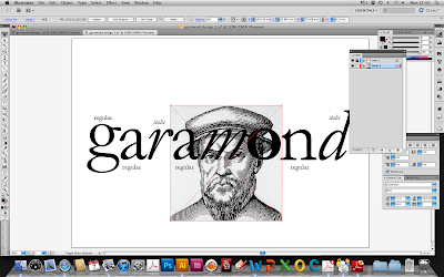
I have used grids to get everything in line, as I have learnt from the previous project, where I didn't use the grid, not everything was in line as much as I would of liked. This was a quick first idea, mainly to get used to using the grids and lining up all the type. To make this idea better I would make the 'aramond' part the same width as the G, possibly making the G slightly bigger, instead of shrinking the other text.
-----------------------------------------
Idea Two:
(1) First of all I did all the letters in this idea separately, in order to be able to place and edit each of them individually. I wanted to use all of the typeface family, because I think that after editing and placing each letter it looks allot more interesting with a variety of things to look at.
(2) I added an image of the creator of Garamond (Claude Garamond) that I found on the Internet, to give it a bit more interest.
I think that the image fits well because the effect of the way it has been make then tells us that the typeface is old and has that old style.
(3) I have placed the face of Claude Garamond here because I think it sits well inside the O, it is as thought he has been framed. The importance of him being on the front of this postcard is high because being the designer, it is appropriate and if being interested in type, recognizable.
(4) This part here is just showing that I have cropped the edges around the image of Claude Garamond. Making the edges round to be able to fit inside the O. I did this using Photoshop, making an oval the right shape and then erasing around the edge.
(5) This is my final for this design idea. I am pleased with the outcome of this idea because I it is simple and effective. The plain black and white theme running throughout I think emphasises the impact on the image and how it all links together with the description of the text.
-----------------------------------------
Idea Three:
This idea I think was quite strong with the colour. I wanted to experiment with small bits of colour within an idea and I think it has worked quite well. Although the green has no reason to be there, that is the only reason I don't think that it would be suitable for a final. I think it looks quite strong as a design but not quite right for what I need. In the image just above I have made the O in black and I don't think it looks quite as interesting. I was inspired to do this idea from poster research that I did from the typeface.


No comments:
Post a Comment