Monday, 28 November 2011

development of ideas

Here I am going to show images and screen shots of ideas that I have had. I have decided to do some quick experiments with different ways in which I could produce an idea.


This first experiment that I have done is of idea three. I really liked this idea because it is not directly obvious as a surfing cover. But within developing this idea I am going to add things that make it into this, maybe obvious or not so obvious, but I will decide this as I go along, seeing what looks better and more suitable. 


This screen shot was the first few lines I did of the outline of the VW Camper van.


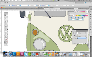
Here I have taken two screen shots of the VW badge. I think that this is one of the most important aspects of the vector drawing so I wanted to make sure that it looked good.


This screen shot is a more progressed version of the outline drawing of the VW Camper. At this stage I think it is going well.


In this stage I have used Photoshop to colour in the VW. I have used block colour on the van to create the graphic and simple look to it. I really like the colours that I have used, they are calm and the cream and green I think look good together. 


This image here is the jpg of the image I have created. This is not the final piece that I am using. I just wanted to see what the van would look like in full colour before I add more to it. I am planning to add more details around the van that relate to the surfing culture.
To develop this idea forward I am going to create more to the image creating the whole of the front cover. 


This screen shot is just to show the development I have done on the VB Camper van image. I have just added some small extras, including the mirrors, which I forgot to put on the first time and some shine on the camper and lights.


This experiment here was simply a happy accident. I was on photoshop with the JPG and i tried to magic want around the edge of the VW and by pressing back space after this it created this. I think it was because it wasn't a layer, as it was the background flat image. I really like this though, by experimenting and playing around with the image I sometimes tend to come arcross things that I wouldn't be able to create if I tried. 

----------------------------

Here is the basis of the front cover magazine that I am going to use. 


Tuesday, 22 November 2011

Presentation on surf culture


This is a presentation sheet that I have made ready for a class on the 22nd November which includes listening to everyone elses subculture ideas and research. 

Monday, 21 November 2011

Ideas

IDEA ONE.


Here is just a quick few notes and a small thumbnail of an idea that I had after doing some research into the work of the graphic designer David Carson. 

Here is an image that inspired me to put a slight hand drawn aspect to the design.

Idea for the Big Surf cover from '02 designed by David Carson. CD cover and interior spread.
http://georgebatesstudio.blogspot.com/2010/09/its-always-interesting-for-variety-of.html
A small section of the Carson image from above.

The hand-drawn part of the idea that I have done a sketch of was inspired from this Carson image. I think that this could work well as a section of the cover and flowing on into the double page spread back drop. I think that the photography and hand drawn combined works really well. I have experimented with it before and using mixed media is something that is always original. 

IDEA TWO.

This was only a second idea sketch. I'm not as keen on this ideas as I am for my first. The bikini and swim shorts do fit well with the theme that I have chosen but I think that it is too obvious and doesn't really show creativity within an idea because the two items are right there in a big format, not really leaving much space. I did this idea quickly thinking I could create something else better from it, I may come back to this in the future, taking certain aspects from this idea to create something better.

IDEA THREE.

This idea is something that I thought of after seeing a VW drive past me on my walk home one evening.  It was a classic VW Camper van that had been renovated and looked in perfect condition. With this idea I want to make a VW on illustrator and recreate one with my choice of colour. I think that the colour I want to use for this idea is neutral colours, I think that this portrays the calm atmosphere that you would associate with the surfing lifestyle. 
IDEA FOUR.


This idea was another thumbnail drawing I had after looking at a few images online from artist called... It is made up of dots. I would like to make an idea of a wave that is created purely from dots and different sizes of dots.

Ideology in the surfing culture

Ideology is a set of beliefs held by a group of people. 


Binary opposites for the surfing subculture:


• Life & death
• Safety & danger
• Beauty & ugly
• Rough & calm
• Sun & rain
• Skills & learning
• Dressed & undressed


These are all the opposites that I think apply to my chosen subculture.

Covers and layouts

COVERS.


 As I am designing my cover and double page spread for Creative Review, I have looked at a few double pages and covers that have been designed by them previously. 


Nice image of a mud-spattered lawnmower racer from ourHondamentalism campaign used on the cover of Creative Review's photography annual.
http://wklondon.typepad.com/.a/6a00d8341c823e53ef010535881c16970b-400wi
I think that this front cover from Creative Review is effective and eye catching. At a first glance I thought this was an illustration because of the speckled effect from the mud and that it was in black and white, but until I looked closer I realised it was a photograph. Although I don't think that I will do something quite so simple as just a photograph for my front cover, I did like the striking image on this front cover.

http://www.mrianwright.co.uk/mass-production/chuck-close-mass-production/02-Creative-Review-Cover-
 This front cover is inspiring to me as I think that an image doesn't need to be seen as it is up front, like this image, it can be properly viewed from a distance and on a shelf in a shop, this is what you would see - from a distance. In my ideas I think experimenting with this effect would be worthwhile and exciting.

http://www.omgdaily.com/blog/?tag=dazed-and-confused-magazine-dowlonad

Whilst looking through a selection of magazine covers from Dazed & Confused this one in particular caught my eye. I think because of all the colour on the faces. The face make up is unusual and not what  even a clown would wear as their 'normal' look. This has a sinister feel to it, like the mouth joining on to both girls, it reminds me of the Joker from the Batman films. This has inspired me to want to put colour into my designs. 

http://www.brandish.tv/tag/dazed-confused


http://www.allposters.co.uk/
-sp/Sex-Pistols-God-Save-The-Queen-Posters
_i3632032_.htm
I was going to look at some other magazine covers, but before I found this cover by Dazed & Confused. It has a punk theme going on. It reminded me a lot of the Sex Pistols 'God save the Queen' image that is well known. It doesn't really link to my subculture in anyway, like the other covers I have looked at could be linked and portrayed in a similar way to my subculture, this one however I think just caught my eye with the British theme that I found a really strong way to get peoples attention with the colour palette.


http://popshotpopshot.com/magazine.html
These two magazine covers from the poetry and illustration magazine 'Popshot' relate to what I would like to do for my covers the most out of the ones I have looked at previously. I would like to have a illustration feel to them. Whether done by hand or on Illustrator I think I would like to go down this kind of route rather than a photograph. I think these kind of covers are a lot more appealing and interesting to look at, they are more personal. I do beleive that they will only target a certain audience but I think that the magazine is designed and created for those people anyway. 

Print Making magazine front cover (found in library)
The simpleness of this front cover is what interested me. The way that it takes up the whole page I think is a creative way to get peoples attention. It becomes almost like a poster before you notice the text. 

The Visual Dictionary of Illustration by Mark Wigan
This is a front cover that I found on a book in the library. It is not a particularly interesting book cover, but if you are someone who is interested in typography than this could entice you in. although the book is actually based on illustration I don't think that the cover portrays what is inside well. 


DOUBLE PAGE LAYOUTS.


Looking at some double page spreads from Creative Review has definitely helped me think of a few ways in which I would like to begin designing ideas for my double page spread. I have looked at quite a few and these two that I have picked from the most recent issue caught my eye with where the images and text has been placed. The one on the bottom is the kind of layout that we have been looking at in class, I think this is a good and effective easy way to be able to read text easily and relate back to the images. I think in my designs I would like to experiment with placing the text in more unusual ways, as the theme of surfing could help this be a lot more 'out there'. 


http://www.spraygraphic.com/ViewProject/3469/normal.html

This magazine layout I find really interesting with the quirky ways in which the text has been laid out. It fits well with the theme that it is showing in the images. The rock and roll look to the pages all links well with every piece that has been put into the double page spread. The colours and shapes that jut out into the middle of the page direct your eye to the images.

Double page spread from Printmaking magazine
There is quite alot of text on this double page spread which I don't think I want to do with my double page spread. I think that it takes away the attention from the images. Although there is quite al lot of text I think that the way that it has been placed around the images and the title is good. The columns split it up enough for it to be easy enough to read.

Double page spread from The Visual Dictionary of Illustration by Mark Wigan
I think that the way out of this book is a lot better as there is less text. Although it may also be because the book is a lot smaller than the other. The text will need to be the same size so it is still readable. So therefore there has to be a little less on one page. 


Double page spread from Communication Arts magazine
When I first saw this double page spread I thought that it was quite cluttered and almost as though it had just been thrown on to the page. I don't think that the borders around the images make it look as though it comes from an arts magazine, but more of just a normal information journal. Its quite child like to have borders. The placing of the images I think also doesn't do it any justice. 

Double page spread from Communication Arts magazine
Compared to the double page spread previously this one has a lot better layout. The images are set in a much better place and inline which is easier on the eye. I think there is just the right amount of text on there too which doesn't overwhelm you when you see the pages. I think from my point of view, the images mean a lot more when you first see a page than the amount of text. 

Double page spread from Printmaking magazine

This also a good and easy layout. I think that because the text is all set at the bottom of the pages it is easily know where to look and read first. 

Surfing culture - style, graphics and history

Every subculture has its own dress style, graphics, history, jobs, music, places and general feel to being within the subculture. 
Surfing definitely has all of these as an individual feel and style. 


DRESS/STYLE.
When you think of surf style dress sense, you generally think of bikinis, hawaiian print and shorts. There are certain shops that do this as an whole style sense, it has become more world wide known as a style but you can tell the difference between a surfer and some body who just dresses in some aspects with a logo. The brands that are most known for their surf culture are: O'Neill, Billabong, Animal, Rip Curl, Quicksilver and Roxy.
Part of the surf culture style, especially with woman is the hair style. The usual and most recognizable style is a slight wave, blonde or light brown, a natural look, same goes for the amount of make up, usually minimal if anything. 


Stephanie Gilmore - one of the most accomplished surfers in the world. (HAIR STYLE)

http://quiksilver.eu/en-gb/women/featured_women/20110215152915RIDE740317579416/Stephanie-GILMORE.html

GRAPHICS.


http://macthemes.net/forum/viewtopic.php?pid=769106
These are two of the brands that have the clothing and the culture. They all host events to do with surfing. If you look at the logos from the brands they all have some kind of wave image involved. 
David Carson

Cover for surfing issue.
http://georgebatesstudio.com/portfolios/9

David Carson

Cover for surfing issue.
http://georgebatesstudio.com/portfolios/9
These two posters are made by a graphic designers called David Carson. I think that both of these posters are interesting. They both have a personal and first hand illustration feel to them which I think makes them work. I would like to incorporate this effect to ideas that I am doing.  

HISTORY.
http://www.surfingforlife.com/history.html
"  In the early days of surfing in ancient Hawaii. Surfing was a deeply spiritual affair, from the art of riding waves itself, to praying for good surf, to rituals surrounding building a surfboard. Surfing was not only a recreational activity, it was also a training exercise for Hawaiian chiefs and a means of conflict resolution. There were two kinds of surfboard in these times, an 'Olo' (rode by the chiefs or the noblemen known as the 'Alii') and a 'Alaia' (rode by the commoners). The wooden boards were made using the Wili Wili, the Ula and the Koa tree's. And ranged from 10 to 16 feet long depending on social class… 10-12 feet for commoners and 14-16 feet for the noblemen and chiefs.   "
http://www.clubofthewaves.com/surf-culture/history-of-the-surfboard.php


From reading up on the history about surfing I found it really interesting to see how it came about. I did not expect it to originate from a religious background. Also the way that the surf board lengths, about being how this told everyone whether they were a chief or a commoner was interesting.

Subculture - Surfing

The subculture I have chosen to base this project on is Surf Culture. 
I have chosen this because on doing some research on some of the other subcultures, this is what stood out to me more as an interest and the design and feel to the subculture is definitely one I was more drawn to.
With using surfing as my subculture I think that I will be able to fulfil previous targets like using more colour within designs as when I think of surfing, I think of, fun free and careless and I think that colour and bright eye catching aspects to the cover I am going to create will show this well. 


Monday, 14 November 2011

Using InDesign

For this project, it is essential that I have knowledge on how to use the programme InDesign. I have used Photoshop and Illustrator before but this was something new. After having a lesson on how to make a basic layout for the cover and double page spread, that I need to create, it became a programme that I think I could use just as well as Photoshop and Illustrator.


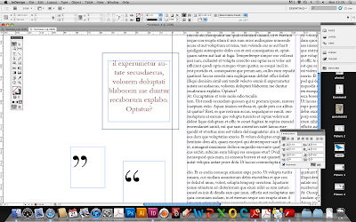
(1) Using the master copy in InDesign I created that small orange tab up in the left hand corner, when putting shapes into the master copy it automatically puts it into every sheet that I create, I can over ride this master copy if on one particular page I do not need this. Using the preset texts on InDesign to get the article where I needed it I copied and pasted it plenty of times so that I could get the placing and amount of text correct. 


(2) I have added the background of the city scape in this step after putting all the text in. As you can see here though, the text goes over the top of the image. 


(3) Clicking on the boxes that the text is in, drag those up and it will temporarily move the text up, by doing this you can see a clear space where you can use the pen tool to draw a rough outline around the edge of the city scape. After drawing all around the city scape, drag the text back down and it will go around the line.


(4) By making the line seethrough (same process as illustrator with the colour palet) it will become as though the line is only there through the text going around it naturally. 


 EXPERIMENT TWO.


Subcultures

A subculture is a group of people with different ideologies and usually fashion and music taste then that of the larger culture they are a part of. Many subcultures also detest the 'mainstream' and commercialization.

http://www.urbandictionary.com/define.php?term=subculture

I understand that this quote from urban dictiotionary may not be the most realiable and correct, but I think that it makes alot of sence and I can understand and relate to it well as a meaning.

----------------------------

I have looked into subcultures online and made a short list that I would be interested in looking into futher for this project. The ones that I have found are:

-Rocker
-Surfer
-Grunge
-Hippie
-New romanticism
-Mod
-Preppy
-Biker
-Glam rock
-Skater
-Greaser

Project three brief - Subcultures Creative Review cover

The brief that I have been given for this project is to create a cover and a double page spread for Creative Review. I have been asked to depict the subculture's revival and pay homeage to the first flush of that subculture.

These are the instructions I got from the brief for the cover and the double page spread:

Cover: You must incorporate an image that you have made yourself (in any media) and some wording giving a lead into the article. Consider your choice of typography carefully and relate this to your findings about the style of Creative Review.

Double Page Spread: You must check the style of typical Creative Review articles first and make sure that your design is appropriate. You may “borrow” a text about the sub-culture from the internet (giving the reference for the source in your sketchbook). You may use found images that are appropriate or you may make images yourself. Found images must be referenced within the page and must be of high resolution (300+dpi. No gifs). You will be down-graded for using low resolution images.

Make sure you know the both the format of Creative Review in terms of size and layout, as well as the kinds of style regularly used.

Wednesday, 9 November 2011

Evaluation

For this postcard project, I think that my pieces meet the needs of the brief in a visual communication approach well. I think that I have keep both postcards simple but I believe that they would attract people in to the conference. I also think the reverse of the postcard meets the needs of the brief well as I have kept it to a minimum but also writing enough information for you know enough to want to carry on finding out more about this in the conference. I don't think that my postcards fail to meet the brief. The only way I would say this doesn't meet anything is my personal targets made by myself. I said that in future projects I would include colour. I have experimented with more colour, but I decided against it for my finals. In my history of type postcard I included a small injection of colour, but they still remain quite dark and contrasting to the white background, which is what, for my design, I think worked better when looking at my other, more colorful design for the Garamond postcard. The strengths in my postcards I think are that they are very simple and instantly know what they are showing and advertising. Anyone who is interested and has some knowledge of type will know the typeface that I have written and used on the front. The weaknesses of the visual I have used might be because it is simple. Personally I think it is a strong point, but some people may think differently and react better to colorful postcards. I does not cater for all opinions of effectiveness. This links to the audience also, people may mis-read or mis-understand what it is about because of these reasons. The target audience for these postcards are designers, students of design and the general public who have an interest in type. 


My time keeping within this project was good, as it was only a 2 week project I was very aware that time was not on my side so I had to use my time wisely. My research for this project I found quite difficult as there was not always reliable sources online for the history. Allot of websites said different things so it was difficult to get the correct information I needed. I went into the library to find something more reliable and found some books on text and this is where I got my characteristics information for Garamond. I drew conclusions from the research with the blurb, I just used the basic part of information that I found, with my research I did get some ideas, mostly from other posters that I found has used the same text that I was using. I found these really useful and gained allot of ideas from them. I used self evaluations throughout my development, it helped me because I could go back and read what I had already done and think back into new ideas from this. It keeps document of what I know and research. I used experimentation within this project with potato cutting the letters, this wasn't as successful as I'd hoped but it was worth trying to see what effect it brought me, and I may even use this in a future project. The parts in this project that I enjoyed the most was designing the postcards with an allocated typeface, because I didn't have any other typeface to use, it was interesting to try out more experiments and getting to know what was possible within just one typeface. What I least enjoyed though was the research, because I found it quite difficult to find appropriate information, another thing that I thought needed to be different with the project as a whole was that some people were not allocated typefaces that were available to us.The parts that I think I could improve on was the amount of research I did for this. I would of liked a bit more time on the project and I think this would of given more time and less time to panic on the amount of research I needed. 

Final of History of Type postcard


I am really happy with my final design for this postcard. I think it is a really strong piece that gives it a playful and exciting feel. The letterpress blocks I think make it work really well, as it explains what I am advertising in the postcard. The text on the back also does the same (like the previous final idea - Garamond). 


Development of second postcard

So, the development of my second idea came from looking at many images online of the letterpress blocks and I decided I would like to incorporate those blocks into my actual design. After doing my experiment with the potato blocks, I feel that this approach was much more appropriate and clean cut - which is what I like in my designs.


(1) Firstly, I went around a simple letterpress block on Illustrator using the pen tool, this didn't take very long.


(2) My next step was to create the letters that I wanted to use. I decided that I was going to use the first line of the part of information I was given for the compulsory text I had to put on the back. I thought that the most effective way I could show this is to use both 'prints' and the letterpress blocks.


(3) This is a screen shot of what I feel is my final. I am pleased with the outcome for this because I think the small strikes of colour that I have put in really make it that slightly more eye catching. Also the letterpress blocks make it more interesting, showing that the history goes back to the start of letterpress. 


History of Letterpress

Letterpress was invented in the 14th century by a German man called Johannes Gutenburg. Firstly there was movable clay type, first invented in China around 1040. Gutenburg borrowed money in order to invent the world changing technology of Letterpress, using wooden or metal letters. The letters were all individually carved out of blocks of wood and then put into rows to spell what was needed. These were then pressed into sheets of paper to create the pages of text. This was repeated the required amount of times for the copies, text was then also rearranged to create the next pages. In 1812, Fredrich Koenig invented the cylindrical press which sped up the process of printed quite allot, making it easier to create copies.


It has made the progress of our thinking of type today go so far, although we tend to use computers now for most of our typefaces, designers and type enthusiasts would much prefer to use letterpress. I think that it gives the viewer a more personal feel to what they are looking at. Like an old photograph made in a dark room, that photograph has been handled for certain amounts of time, with perfect timing, this takes practice and skill to build and I think this has the same kind of process. It is a costly process, both time and money and so you need both of those to be able to make this way of type work well.